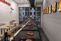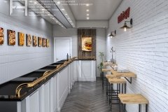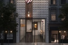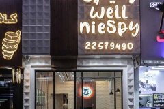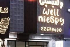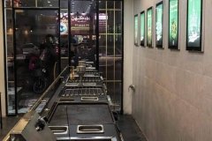
Subject : Facade design and Interior decoration of Wellniespy Fast Food
Location : Dowlat St , Tehran Province , Iran
Executor : –
Designer: Farid – Arjmand Architecture Company
Design team : Mostafa Farid – Saber Arjmand – Farshid Fazli
Building Type : Fast Food
Date : –
Built area : –
Floor : –
Unit : –
Lobby area : –
Building Structure : –
Photographer : –
Description
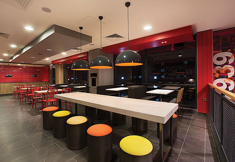
What should be considered when designing fast food?
Fast food design is one of the difficult designs that not everyone can do completely as well. Because in some cases there are more fundamental differences with the interior design of houses. This means that in home design, you often have to put more emphasis on inducing warmth and calm to the viewer's mind. Because we all know that home is a place of peace. But this is a bit of a broader discussion about fast food design. Because other than what was said. You should also pay full attention to the emotions and feelings of people and the physiological states of hunger and appetite in fast food customers. So we have to use warmer colors. So that we can satisfy our customers psychologically.
Imagine we are going to fast food and before that we are extremely hungry. As soon as we look at its environment, it seems that we no longer have the motivation to be full. This can often be the result of poor decoration and improper design of a fast food. But if we can design fast food in a way that is in line with the wishes of customers. We can value the desires of our customers and their emotions and appetites. That is why we said that this work requires experts who can identify and understand the needs of these places. On the other hand, inexperienced people only pay attention to the temporary beauty of work and can cause great harm to these jobs. Join us to tell you the secret of success in this field.
Diverse styles in fast food design
It is better not to make the issue that difficult. In the previous section, we mentioned that not everyone can design fast food. But we did not say that not every plan can be implemented. Incidentally, in this field, too, an infinite plan can be presented in accordance with the same job and place. But it just has to be relevant. In this regard, people’s tastes can be very wide. For example, a variety of classic, modern, industrial and postmodern styles can be implemented in fast foods. For example, we know that more industrial designs are used in McDonald’s and KFC branches. You can also use different materials in these styles.
Such as wood and brick or any other related material. Also, the range of colors can include orange, red, and yellow, and is generally appetizing. Now, considering what has been said, let’s take a look at an example of a Valencian fast food job. We set the base of the colors to white. In this way, we can induce more peace of mind to our customers while eating. In some corners, we use red, which is the center of appetizing colors. Now subconsciously customers will have this feeling of calm with a mix of appetite. In order not to take the design too far from nature, we use a little wood color material. This will add to the customer’s sense of calm.
Use food pictures
Another thing that can actually be considered a kind of respect for the customer’s appetite in fast foods. It is to use our own images of foods and food packages. It must have happened to you that once you enter a fast food and see a python on one of the walls. Or even worse. See a snake in a glass of alcohol. Well, many people are upset when they see such a scene. And they decide not to go to that fast food next time. Or worse. As soon as they see such an irrelevant thing, they leave the place. We all know very well that such scenes often belong to experimental and biological laboratories. And it has no place in a fast food.
That is why it is better to use the image of the judges themselves instead of installing such strange and contradictory scenes. Customers who go to fast foods seek to quench their appetite and hunger. They do not come to see wildlife. And certainly anyone who pays attention and respects such a case will win. Those who are skilled in this work even use colors such as blue or green with caution so that the customer does not look at something irrelevant.
People’s culture and its role in the interior design of fast foods
So far we have talked about things like the deep impact of colors and photos on fast food design. But in this section we will also examine the culture parameter. We know that the culture of even two cities next to each other can be different. In the order that a series of rituals may be performed in a city. But not in the neighboring city. And no one cares about them. The same is true of designs. That is, a design and decor may be accepted in a city. But in another city, depending on the culture of the people, it was easily left for the people. Let’s clarify the story with an example.
In a city like Tehran, projects such as the Wellniespy fast food design can be better implemented. And by the way, it can have great feedback. Because the city of Tehran is one of the metropolises. And people are looking for modernity. But probably the same plan can not be implemented in a small town like Ilam and expect it to be just as responsive. The people of Ilam are mostly Kurdish. And we need to add something to our design that is more a function of the same culture. To make people more receptive to such a thing. This is especially true of the colors and even the materials used.
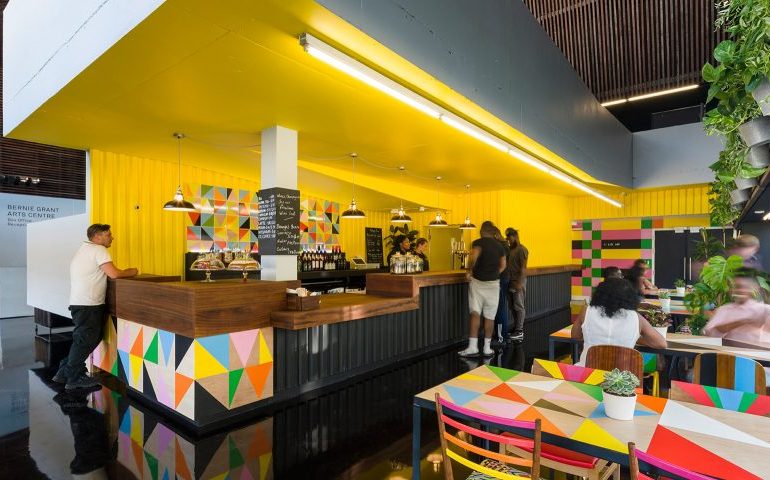
This means that for the people of Tehran, the combination of two colors such as red and white in fast foods may be the answer. But in another city, yellow proves its use better. We want to say that in designing fast food, we must respect even the character and way of thinking of consumers.
Projects that can not be implemented everywhere
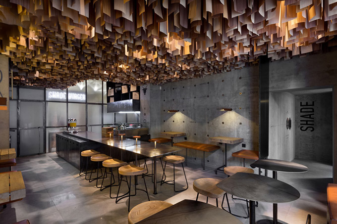
In the previous section, we talked about people’s culture and its impact on fast food design. We now turn to materials such as concrete that can not be used anywhere without thinking. In more northern countries, concrete and the design of a fast food with concrete can be used. Because these people are often forced to use such materials due to the weather conditions. However, sometimes such plans remind us of Russian military prisons during the war. But at the same time, it can be extremely nostalgic for people and, incidentally, lead to public good fortune. However, if we want to present such a plan in Iran, the opposite will most likely happen.
Because our people do not use concrete in all matters and do not get any nostalgic feeling from the designs that the unknown has from prison. Our people are more looking for a sense of peace and happiness. Of course, considering the number of relatively bad incidents that we witness every day in the country. They no longer want to go to a fast food restaurant that is designed like a prison. So in this section we want to conclude that when designing fast food we must pay enough attention to two other factors.
The first is to pay attention to the conditions of society and what the people themselves demand. And secondly, what material is most often used in the area where we design? Pay attention to these two points before doing anything.
