
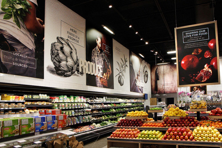
Hypermarket interior design brings together the shopping experience and the practical movement of goods and staff. A large sales floor is not simply a collection of shelves: entrances, departments, checkout, storage and servicing need a coordinated plan. The design should reflect the actual range of products and operation, rather than assumptions that every hypermarket is identical.

Survey the space and define the operation
Record dimensions, columns, entrances, service access and existing installations. Check structural and fire-related constraints before proposing the removal of walls or a larger open floor. An apparently obstructive element may have an essential role that cannot be judged from its appearance.
Define the expected departments, stock handling, staffing and customer pattern. The relationship between the retail floor, receiving, back-of-house areas and waste handling affects the operation as much as the visible displays.
A clear customer journey
Organise departments so people can find everyday products and understand the main routes. Architectural circulation helps explain the importance of legible connections, but retail routes also need to accommodate baskets, trolleys, browsing and queues.
Avoid forcing all shoppers through unnecessarily long detours. Product relationships and clear views can support discovery without making basic shopping difficult. Review the plan for a short visit as well as a full weekly shop.

Shelving, product groups and visibility
Match shelving to product size, stock rotation and reach. Coordinate the height of units with sightlines and signs. Seasonal displays should not block an essential route or hide the location of a department.
Examples of hypermarket and supermarket layouts can support discussion, but the reference should be tested against the project’s dimensions and operation. The arrangement of a large chain store is not automatically suitable for a different range of goods or a smaller site.
Checkout and service routes
Allow for queues, packing and the transition toward the exit. Test busy moments, including shoppers waiting while others pass. A visible checkout is helpful, but visibility alone does not provide enough space for the process.
Plan receiving, replenishment and staff movement alongside customer circulation. Consider goods that need temperature-controlled handling and the access required for equipment. Separating journeys where useful can reduce conflicts, but the arrangement must follow the actual operation.
Lighting, comfort and identity
Lighting should make products and signs readable while limiting glare. Coordinate ventilation, acoustics and surface durability with the building systems and cleaning routine. Brand colours and graphic elements can strengthen identity without overwhelming navigation.
Music, colour and display may influence the atmosphere, but no single decorative choice guarantees higher sales. Evaluate the experience through observation and operational feedback rather than presenting psychological effects as fixed outcomes.
Review the completed layout
Trace a customer journey, a delivery journey and a restocking journey. Test the positions of signs, displays and queues, then review maintenance access and cleaning. In interior design, the successful hypermarket connects a coherent visual environment with workable daily routines.
Keep the focus of this review on spatial organisation and operation. Detailed pricing, specialised lighting specifications and individual retail formats can be developed separately without displacing the central layout questions.