
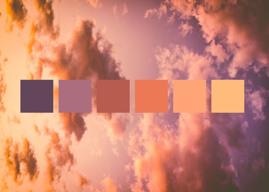
Colour helps establish a room’s identity and focal points, but it works alongside light, materials and furniture. Emotional associations differ between cultures and individuals. They should not become fixed prescriptions for feelings or unsupported health claims. This guide explains how to choose a palette around use and user preferences.
Colour and emotional associations
A cross-cultural colour–emotion study examines shared patterns and contextual differences. An association does not mean painting a wall causes the same feeling in everyone. Colour models also differ: the traditional painting wheel is not the same as light or printing models.
Yellow

Often associated with light and optimism, yellow can highlight a selected area. Saturation and coverage matter; this does not establish a therapeutic effect or guarantee productivity.
Green

Green often evokes nature and can work with timber and neutral colours. Choosing it does not reveal a user’s personality or demonstrate improved bodily functions.
Blue

Blue may suggest calm or seriousness, and sometimes sadness in a different context. Light and dark shades work differently, and blue need not be excluded from active spaces.
Red

Red draws attention and can create focal points. It does not guarantee increased appetite; assess it with lighting and the wider palette rather than covering a room automatically.
Purple

Purple can give furniture or accessories a distinctive presence. Its success depends on proportion and coordination, without a fixed numerical increase in attractiveness.
Orange

Orange can suggest warmth and provide visual emphasis. It should not be described as increasing oxygen delivery to the brain: a visual association is not a physiological claim.
Brown

Brown relates to timber and natural materials and can feel warm. It does not indicate limited thinking; varied tones and textures can prevent monotony.
Black

Black can define edges and establish contrast. Its reception depends on light, coverage and preference, without assuming a fixed difference between women and men.
White

White can form a neutral background, but its apparent warmth changes with light and surrounding materials. Test it rather than assuming it suits every surface.
Choose for the room’s use
A restaurant with a bold visual language might use warm colours to define areas or elements, while service, lighting and comfort remain important. Softer tones can be tested in resting spaces when users prefer them; there is no compulsory colour for each activity. Specialist healthcare environments require assessment beyond general decorating advice.
Build a coordinated palette
Choose a dominant colour with supporting and neutral tones. Ocean blue, for example, could be tested alongside cream and orange or white accents without a mandatory ratio. Compare the wall, furniture and accessories together: broad coverage differs from a small detail in the same colour.

Test samples before committing
View samples beside floors and curtains in daylight and evening lighting. Assess tone, sheen and cleanability before approval. Farid + Arjmand’s interior design work connects the palette with the room and its users. The original external link to Interior Design magazine is retained for visual inspiration.