
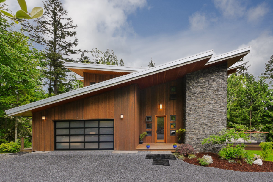
Colour contributes to the identity of a facade, but its effect cannot be separated from material, light and the surrounding buildings. A colour that appears balanced in a render may look stronger, flatter or darker on the finished surface. Choosing it well requires more than a small screen sample.

Read colour together with the material
Stone, brick, metal, glass and painted render reflect light differently. Surface texture, joint patterns and gloss change the apparent colour, while natural products may vary between pieces. Compare facade materials through real samples rather than assuming that the same colour code produces the same result on every substrate.
The building’s scale matters too. A dark area that works around an entrance can dominate a whole elevation. Use the main surfaces, openings and secondary details as a hierarchy, so accent colours support the composition without making every element compete for attention.
Daylight, orientation and thermal performance
Inspect samples in direct sun, shade and the light of the actual site. A north-facing wall and a sunlit west-facing wall can read differently even with the same finish. Windows, neighbouring reflections and artificial lighting also affect the appearance.
Dark colours may absorb more solar energy in some materials, but colour alone does not determine a building’s energy performance. Reflectance, insulation, glazing, orientation and shading need to be assessed together. A dark facade should not be described as automatically more energy efficient.
The facade within its urban setting
An elevation is seen beside other buildings and against the street. Review nearby materials, dominant tones and the project’s intended identity. A calm palette may provide continuity; a controlled contrast may clarify an entrance or a change in volume. Neither choice is universally correct.
An online architectural colour palette can help compare relationships and organise references, but it is not a substitute for physical testing or applicable local requirements. Images can guide the discussion without determining approval or the final specification.

Maintenance and the condition of the surface
For an existing facade, identify the substrate, exposure and condition before selecting a coating. Cracks, water entry and failed joints need appropriate investigation and repair; painting over them does not address their causes. Compatibility, adhesion and preparation affect the lifespan of the finish.
Consider how dust, rain streaks and repairs will appear. A colour selected only for the first day may become difficult to maintain across a large elevation. Ask about cleaning methods, repair matching and the weathering behaviour of the actual product.
A practical selection process
Prepare a small group of options linked to the architecture. Make samples large enough to reveal texture and place them beside the planned stone, metal and glazing. Photographing them is useful for records, but the decision should also be made directly on site.
Review the selected scheme at both street distance and close range. Check the entrance, parapet, windows and joint rhythm, then document the product, preparation and application requirements. In facade design, colour works best as part of a coordinated material and construction strategy, rather than a final decorative decision.
A suitable palette can strengthen a building’s identity and legibility. It does not, by itself, guarantee higher property value or solve problems with proportion, detailing or construction. Those issues need their own design response.